2010 SRX turbo - Exterior and Design
Part 1 - OverviewPart 2 - Our test carPart 3 - Exterior and DesignPart 4 - Interior and ElectronicsPart 5 - Ride and Performance
Image galleries - SRX Review Pics | SRX Pics from Cadillac It is impressive how well Cadillac's design language translates into multiple segments. We all know how well it has worked in previous products, but who knew it would work on a crossover this well. Also as or more impressive is how much the look has grown and matured in the second round of Cadillac's Art & Science design language inspired products (we have to thank Bob Lutz who came on board and publicly panned the original look that the first SRX shared with the original CTS and the XLR and forced the designers to work this hard). However, the language, post-Lutz, is certainly still recognizable as being from the same overall theme in the new cars - the execution is just a quantum leap better.
The SRX takes the stunning look of the new CTS and effortlessly (it seems) extends it into this tall crossover segment. Let's take a quick look at this execution and talk a bit about what works and what doesn't.
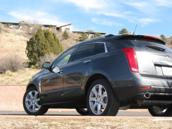
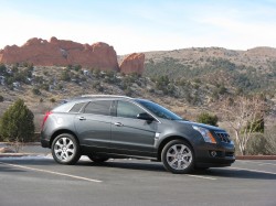
 Fascinatingly well done with the SRX, and what still struck me even at the end of my week driving our test car, was how the greenhouse was executed to give an almost coupe-like look in profile without actually compromising the cargo carrying ability or the actual roofline. It does this by hiding the true height of the roof by skillfully positioning the roof-rails. Also contributing are the chrome trim around the windows that emphasize the desired swoop of the line rearward and downward. The overall effect is to emphasize the sporty look while allowing function to not be compromised. BMW could go a long way to study this technique for subsequent 6-series design work - you know, if they want the next one to actually be attractive.
Not as well done, and also fairly obvious in profile, is the long front overhang. The assumption is that the hardpoints the designers had to work with made it necessary to go forward to get the desired pointed prow that gives the modern Cadillacs there 'V' shaped front design. If the corners were fixed, this would require that the front/center be pushed significantly forward to get the design in place...which is what we see here. Unfortunately, this results in an awkwardly long front. Thankfully, this is not nearly as noticeable unless you are looking at the SRX straight from the side.
It is a pleasure to spend time looking at the new SRX and look at all the little details that old GM might not have ever allowed to pass, but that together make for a rich feeling vehicle that strikes us as 'crafted' more than simply manufactured.
It was only a few years ago that the number of finishes on a modern car were limited to paint, black plastic/rubber, silver painted wheels (with chrome or polished as an option), glass, and chrome. The SRX has replaced some of the areas that would traditionally been chrome or black with brushed metal finishes that lends richness without an overload of chrome. Areas where this is most noticeable are the roof rails as well as the front fender vents. This works quite well in this application.
Speaking of the fender vents - the overall shape does fit well into the space between the body-side character lines, but feels a bit over the top for some reason...it could be the sheer scale with the panels being too large to work.
A few touches that work better are both at the rear of the design. The tail-lights are an even more blatant nod to the Cadillac tailfins of yore than we have seen before. They carry the body lines and surfaces further back than the hatch, actually jutting rearward - though not feeling even a bit retro or overdone. Well done and very Cadillac.
A final touch that is seen on other manufacturers products, but still goes a long way to suggest that thought went into design are the integrated exhaust tips that frame the lower portion of the rear valence. They are suitably large, well shaped, and trimmed in just the right amount of chrome.


After dark, we get to see the latest interpretation of Cadillac's LED-based light-pipe accents in the front and rear lighting. This gives the SRX a now distinctly Cadillac visual signature at night that ties it to the CTS and likely to all future Cadillacs over the coming years. So, overall the SRX is well executed with a few (some likely engineering driven) gaffes that keep it from being a home run. Call it a solid triple, though.


Next up - interior and electronics...
