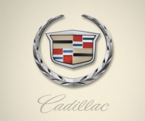
Cadillac Dropping the Laurels from Logo
 Cadillac is rumored to be working on a complete re-think of their logo in the coming months.
The reports are that the laurels that surround the Cadillac shield may be on their way out. We should see the new logo applied to a concept expected to be shown in August at Pebble Beach Concours d'Elegance.
Sources quoted that are familiar with the work are suggesting that Cadillac plans a simpler design that might make positioning the logo on the nose of the car (up from the grill) easier than with the current design. Simple logos are the standard if you compare against the logos from Mercedes, Audi, Lexus. In this competitive set only BMW has a logo with colors (and only white and blue at that).
 Strangely, this would suggest several changes to the new CTS that goes into production later this year (if it will carry the new logo). If you go back to photos of the 3rd gen CTS, we see the current logo not only on display but portions of the front and rear styling that are designed to work around the round-ness of the laurels. This could suggest either that the new CTS will be altered to fit the new logo's design or that the new design is also going to circular.
Source: Automotive News

